The Incredible Shrinking GOP

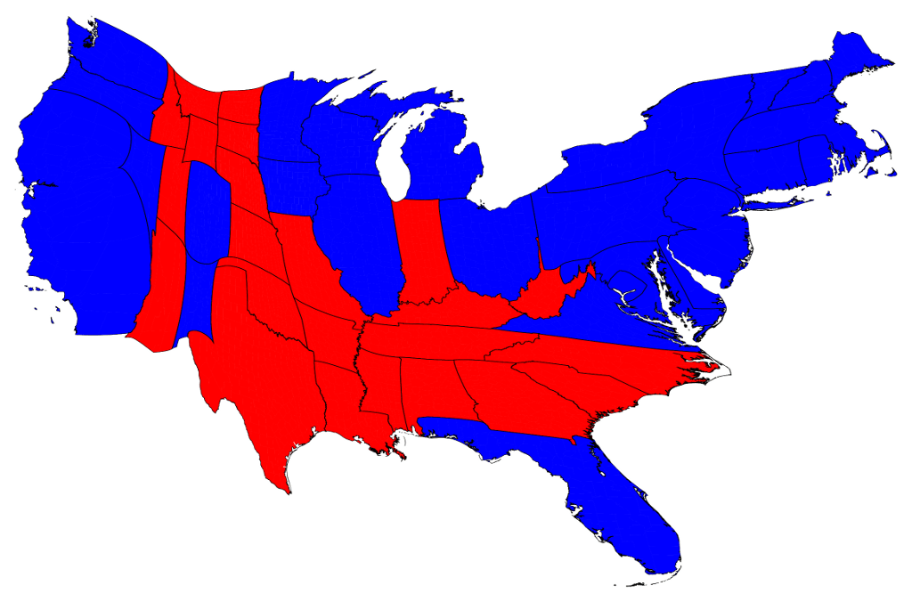
Cartagram by Mark Newman showing the relative strength of the Democratic and Republican vote.

The results of Tuesday’s election, in which Republicans failed of their two principal goals, and indeed lost ground even in the House, indicate that the GOP is in danger of becoming a minority party.

The cartogram above, one of a series of maps created by Mark Newman of the University of Michigan to show the real strength and distribution of the popular vote, depicts the limits of the GOP’s popular appeal.

While the Republican party continues to command the allegiance of bands of Americans in southern and land-locked western states, these states are not particularly populous.  In the more heavily populated and cosmopolitan areas of the United States, the Democratic Party under Barack Obama is consolidating its hold.

Voting strength of Democrats and Republicans by county, with purple showing county-level mix

Moreover, many of the counties that the Republicans managed to win Tuesday are actually divided and could readily swing back the other way.  In the county-level map above, only the streaks that are pure red and reddish can be regarded as Republican strongholds.

The Republicans in denial

Interestingly, the Republican leadership seems incapable of grasping the fact that its positions and values are increasingly out of step with those of the nation.  John Dickerson of Slate, appearing on Washington Week on Friday, described the Romney-Ryan campaign’s illusory anticipation of victory: it simply couldn’t imagine there being enough Americans to support the President, though numerous polls had shown that support for him was holding and building.  A contempt for the whole of the electorate, and an inability to embrace its diversity, spelled doom for Republicans in the 2012 campaign.

Look for Republicans to continue to grasp at procedural, legal, monetized, and PR-based tactics to sustain the illusion that they remain a formidable party.  In fact, unless the Republican Party dramatically transforms itself, renounces extremism, and embraces diversity and moderation, its showing will be even weaker next time.

Click here to view all of Mark Newman’s maps and learn more about what they mean.

MORE ON MY TAKE ON THE GOP:
What If They Can’t Take the Capital? September 2012.
A Great White Nation of Self-Made Men, September 2012.
Moment of Truth for the GOP’s Conservative Wing, August 2012.
Should Leaders Who Can’t Govern Their Party Govern the Country? June 2012.
Is the Republican Party Dying? March 2012.
2008: The Critical Election That Wasn’t (Part II), January 2012.
Parties Made New: Our Critical Elections February 2012.

The Next Political Football: Medicaid

Last week’s Supreme Court ruling on the Affordable Care Act has placed a spotlight on the expansion of Medicaid benefits that the legislation envisioned.  Reactions to the Court’s ruling, which gave states the right to opt out of the expansion, again illustrate the state-level differences in our political culture.  Already a number of states, notably Florida, have declared their states will not be going along, while others (including California, New York, and Illinois) have embraced the measure.

THIS INTERACTIVE MAP on the PBS News Hour website allows you to see where each state stands with respect to the plan and the number of eligible recipients who will be affected in each.

Readers may also be interested in the maps below, showing the US House and Senate votes that led to the passage of the health reform bill.  Click on the maps to see larger maps and full legends.

http://upload.wikimedia.org/wikipedia/commons/thumb/5/54/111th_Congress_roll_call_165.svg/256px-111th_Congress_roll_call_165.svg.png

US House vote on March 21, 2010,
by congressional district, showing yeas and nays by party.

http://upload.wikimedia.org/wikipedia/commons/thumb/9/92/111th_Congress_1st_session_Senate_roll_call_396.svg/256px-111th_Congress_1st_session_Senate_roll_call_396.svg.png

US Senate vote on December 24, 2009, by state.

Maps courtesy of Kurykh on Wikimedia Commons.


RELATED:
Susan Barsy, Progress Isn’t Popular, Our Polity.
Susan Barsy, A Decision We’ll All Feel, Our Polity.
Susan Barsy, The Map of Federal Benefits, Our Polity.
Susan Barsy, Help Understanding the Budget, Our Polity.

The Map of Federal Benefits

I stumbled on this fascinating map published yesterday on the New York Times website.  It’s a national map showing the distribution of all federal benefits to individuals–including Social Security, Medicare, Medicaid, veterans benefits, and so on–by county, so that you can see which counties are most reliant on federal social spending.

What’s fascinating is that the highest levels of federal benefits are not where you might expect them to be.  They are not in cities.  In many cases, they are in “red” parts of the country.

The only way this map could be better is if it included farm subsidies.  I imagine they were excluded because they often go to corporate entities, and this is a map of benefits to individuals.  But because many prosperous commercial farmers in America benefit from this form of government support, it might be included to round out this picture of geographical reliance on federal aid.

Food for thought.